英语
英语 阿拉伯语
阿拉伯语Color plays such an important role in home design, we’ve come to anticipate the new hues delivered each year by the paint companies. This year, the aforementioned color purveyors have all tapped greens as their annual best color choices for the coming year. These are not just any green, however. Sherwin-Williams Evergreen Fog and PPG’s Olive Sprig, for example, take their cues from the great outdoors with soft greens that deliver more natural undertones than greens of years past. Whether it’s a function of an “outdoors is safe” mindset following more than a year of pandemic panic or an opportunity to play off a desire for comfort in homes consumers have been spending more time in, these soothing green hues are something of a departure from recent years where bolder blues, deeper bronzes and soft pastels, particularly pinks, have been featured. The coordinating palettes surrounding these colors of the year also deliver a natural, warmed-up feel.
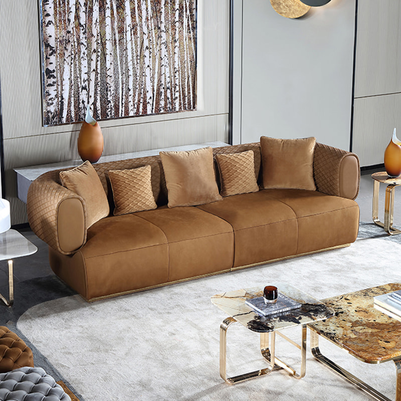
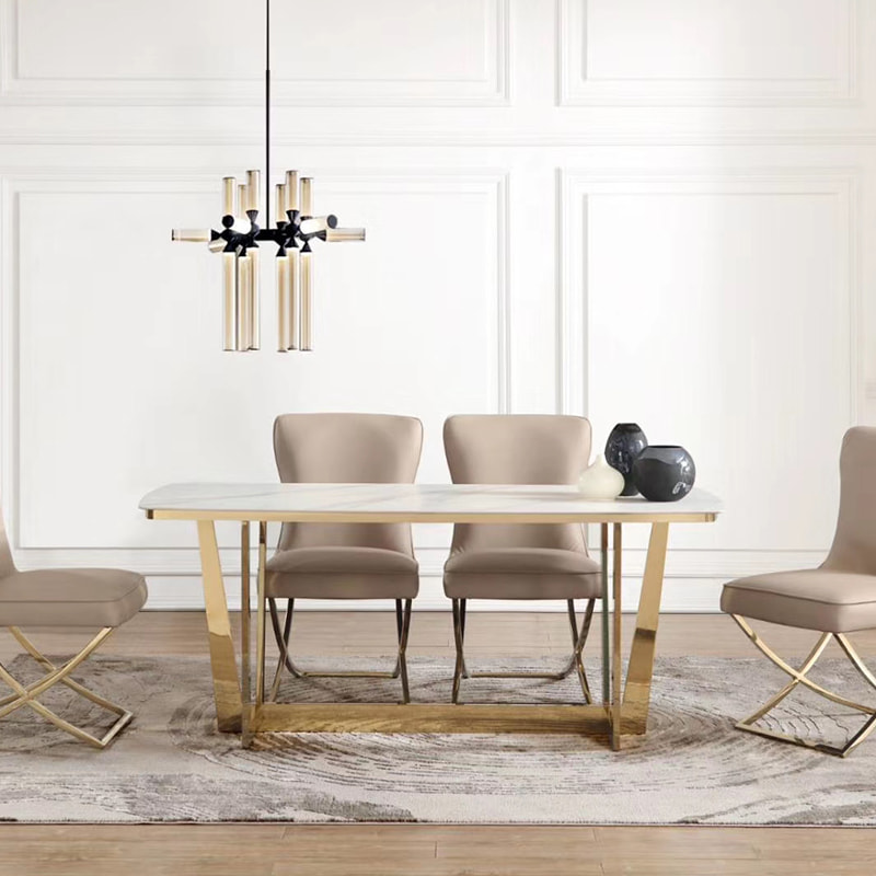
This year, according to industry experts, grays are warming up too, with added brown and yellow undertones in the hues — greige, if you will. This isn’t necessarily a new trend, but it is becoming more prevalent in an effort to create warmth in a space. Beiges and mid-tone browns are back as well as they play off the undertones of rusts, golds and more yellow-toned greens. We’ve talked about warmth and comfort, but there is also a trend toward happy colors. Carpenter talks about creamy hues, not quite pastels but not bold colors either. Tempered by gray undertones, these mid-level hues are happy and calm all at once.
Urich also sees a trend toward pinpointed explosions of color on such categories as wall art and rugs, allowing for fun accents that deliver happiness. Blank Canvas To allow for these varying degrees of color, one non-color that has made a return, particularly on the walls of the home, is white. This creates an open, clean space and allows for a contrast to play with accents designed to stand out. “Homeowners are looking for a super clean palette to put all of these other elements against,” Urich says. “There was a time where everything was white, from bleached floors to kitchen cabinets. White for white’s sake is not the purpose for it anymore, however. Now it’s to create a blank canvas.”
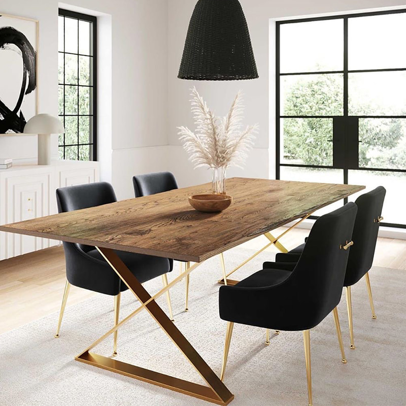
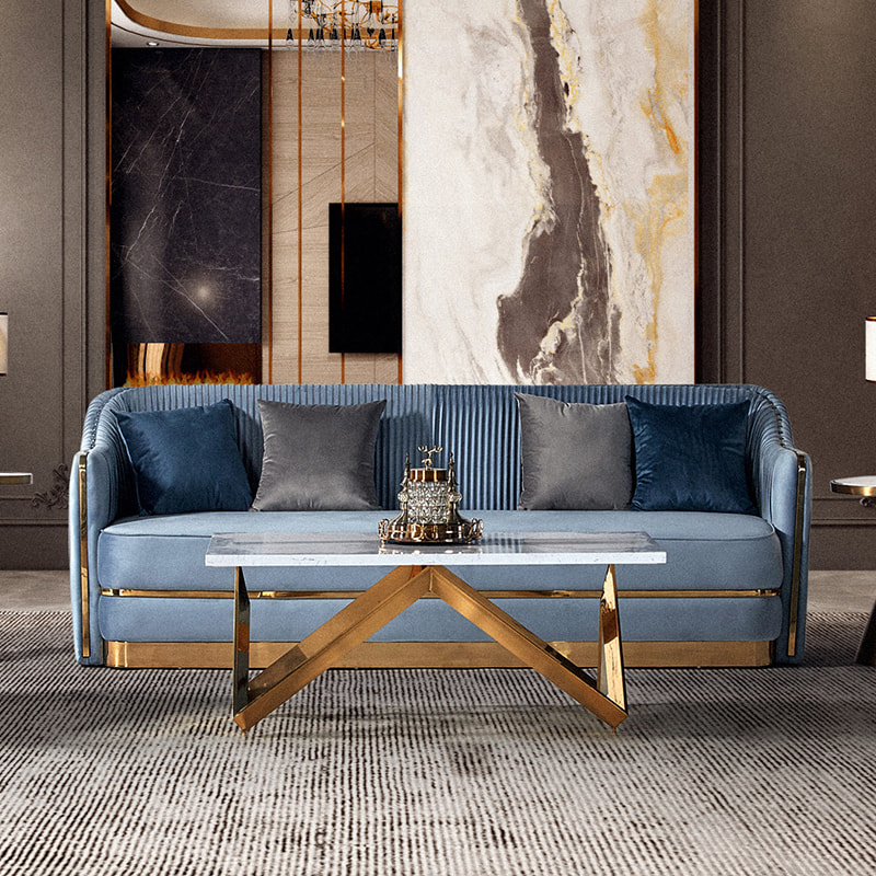
Like white, whatever surface it embodies, there are some colors that never go out of style. Alongside white, black continues to trend in the home, on everything from lighting fixtures and hardware to wood furniture. In black, look for matte finishes as they are more tactile and therefore, more comforting, Urich shares. Carpenter adds that black and white create contrast — opposites that attract and create high impact. Blue is another hue, that while it may evolve from year to year, continues to top the charts of desirable colors for the home.
So where are consumers putting all this color? It really depends on style choices. Blues and greens are always bestsellers, even if they vary in depth and tone from year to year. No longer just for accents or pillows however, varying shades of blues (and some of the other newer colors) are appearing on dominant pieces that are purchased for the longer term — kitchen cabinets, case goods and sectionals, for example.